Revisiting Classic Lighting for a Magazine Cover in November
A Cover Chosen, Unexpectedly
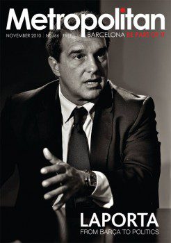
I recently saw one of my images featured on the November cover of a magazine. Always a nice surprise, especially when it’s not the shot you expect them to pick. I’d submitted a few options, including a couple of black-and-white portraits I had shot more for myself than the assignment. I didn’t think they’d use them. Apparently, I was wrong.
The image came from a session where I revisited a lighting style I used to experiment with in my early days—back when I still shot film. I’d been looking at vintage portraits from the ’50s and ’60s, the kind where film stars look like they’re carved from shadow. That old glamour-meets-drama lighting. One image in particular, a friend in a suit from a previous shoot, stayed in my head while I worked.
A Combative Look with a Friendly Backstory
The final photo has a certain tension. The subject looks quite intense, even slightly confrontational. In truth, he was friendly and relaxed throughout the session. But light shapes emotion, and here it pushed the expression toward something sterner.
Given the timing—Barcelona Football Club’s ongoing financial drama and the rumblings of a Catalan election—I can’t help but wonder if that mood influenced the editorial choice. He certainly looks like someone ready for a fight, even if he’s not.
Digital Wins This Round
When I finally got my hands on a printed copy, I felt a bit deflated. The print quality was too dark, and the tones came out muddy. On screen, the photo holds its contrast and subtlety. In print, it lost something.
Still, I’m glad it ran. Even more so because it’s a style I haven’t used in a while—and it reminded me why I liked it in the first place.